Introduction
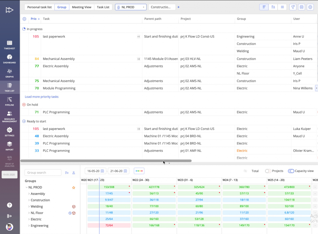
The Capacity View in Epicflow, part of the Group Task List, shows the difference between your resources’ available capacity and their current workload. This view helps project managers assess if resources can handle the work, considering factors like holidays, vacations, and illness. By tracking capacity changes over time, it helps managers plan better, adjust workloads, allocate resources more effectively, and prevent overloading.

#Screen 1 Capacity View
Capacity View – Per Project
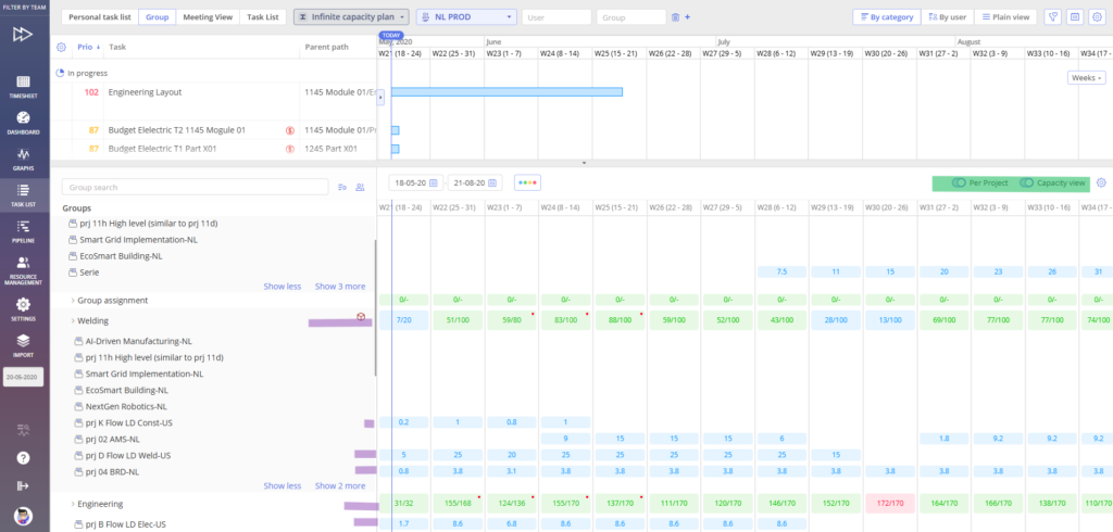
In addition to the group-level overview, the Capacity View can also be displayed per project.
When the Per Project option is enabled:
- Capacity and load are shown separately for each project within the group
- You can see how each project contributes to the group’s overall load
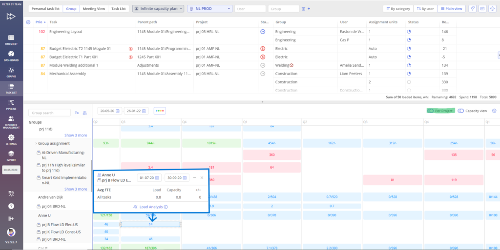
- Load analysis becomes available both at the group level and at the individual project level

Screen #2 – Capacity View per Project

Screen #3 – Load Analysis at Group and Project Level
This view helps identify:
- Which projects are consuming the most capacity
- Project-specific overloads or underutilization
- Opportunities to rebalance work between projects more effectively
By switching between group-level and per-project views, you gain insight into how capacity is distributed across your portfolio.
How to Enable the Capacity View?
Please refer to this article for more information about the Group Task List, of which the capacity view is a part, and how to enable it.
Indicators and Their Meaning
To help you quickly identify potential issues and take action, we use two types of indicators: cell colors and dot indicators (see image above: Screen 1). Understanding their meanings is crucial to using the Capacity View effectively.
Cell Colors as Indicators
These are the background colors of each cell. They show the status of a resource’s capacity relative to its workload.
- Green: The resource has sufficient capacity and is not overloaded.
- Blue: The resource has available capacity, but it is currently unused.
- Orange: At least one resource in a group belongs to two groups and lacks enough capacity in the current group, but has available capacity in the other group, which can be borrowed.
- Red: The resource is overloaded.
- Grey: There is no load and no capacity available.
Dot Colors as Indicators
In addition to the cell colors, a dot may appear on the cell in either orange or red to provide extra information about the resource load. These dots can appear at either the user level or the group level, depending on the visualization option selected in the Future Load Graph.
- Group Level
- Orange: One of the users has a load that exceeds their capacity, however, this user can borrow capacity from another group (meaning the user belongs to two or more groups).
- Red: Some users in the group are overloaded; however, the total load in the group is still less than the group capacity.
- User Level
- Orange: Indicates that the user belongs to two groups, with the load in the first group exceeding their capacity, but the total load across both groups is still within the user’s overall capacity.
- Red: The user belongs to two or more groups, and in one of these groups, the load exceeds the capacity.
You may also be interested in the Workload Analysis article.
