The purpose of this component is to visualize the historical load and output on projects flow, expected future load for the resources, track progress towards a project completion with Burnup and Remaining weeks of planned work per resource.
Screen #1 – Graphs (main)
- To go to the Graphs page, please, select second menu item from the top – GRAPHS.
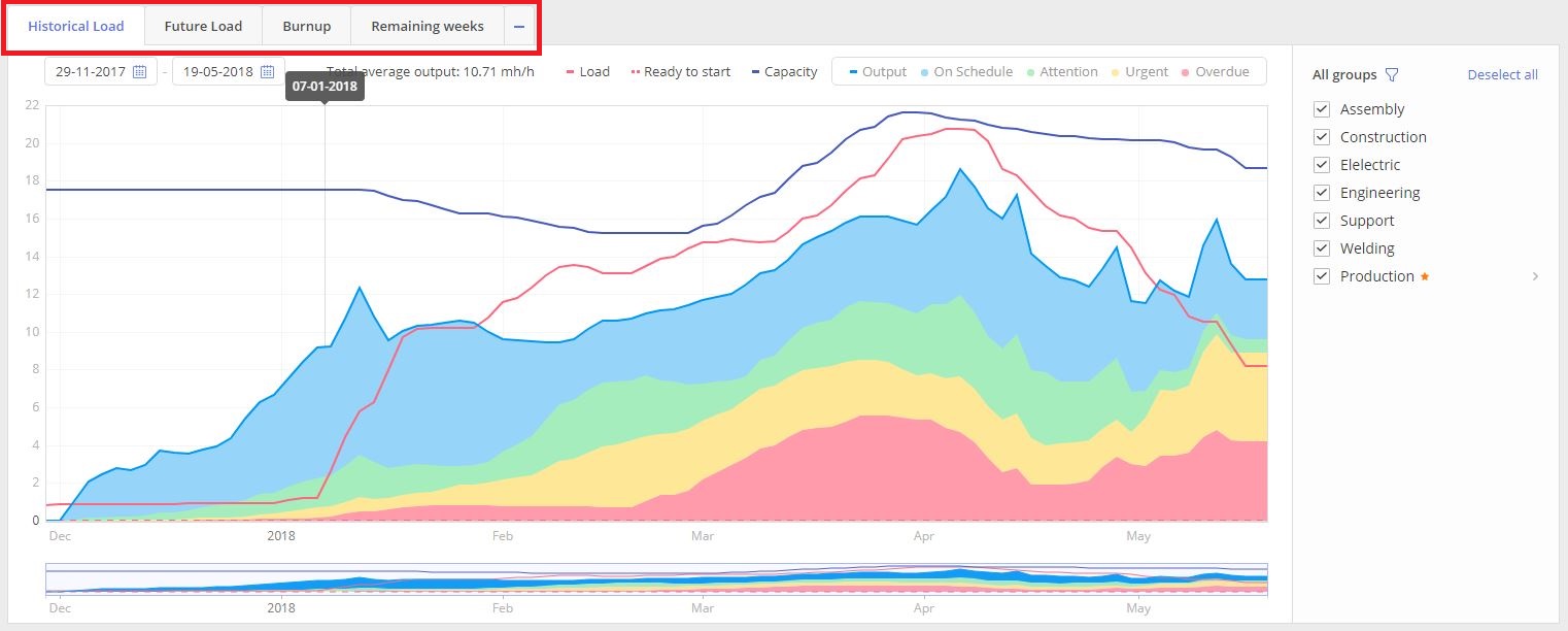
Currently we do have next four types of graphs:
- Historical load
- Future load
- Burn-up graph
- Remaining weeks
To review any of those please select an appropriate tab with Graph name description. In case if you don’t have required type of Graph displayed it can be visualized by selecting from the tab to the left from all displayed.
Screen #2 – Graphs (tabs)
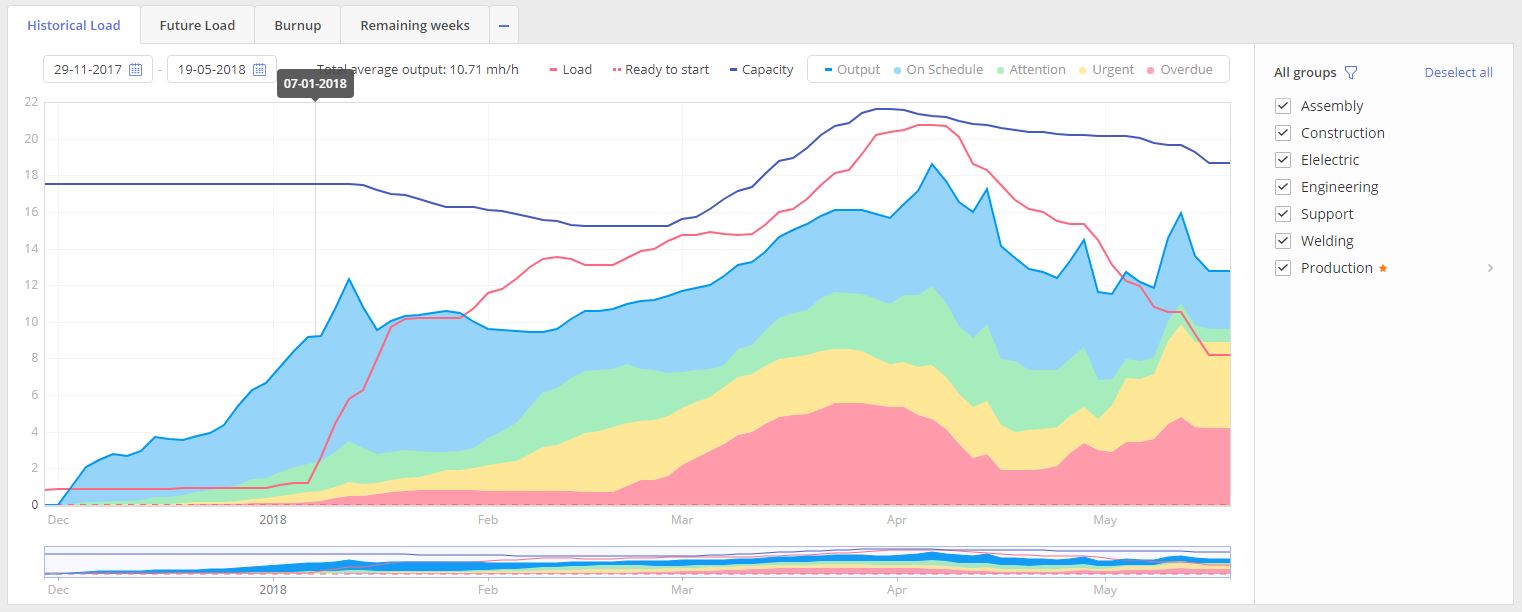
Historical load
Overview
The purpose of this graph is to show your team performance over time in accordance with the projects that we have in the pipeline. This feature of Epicflow allows you to make a thorough analysis of your team progress and compare the load, capacity, and output of your resources.
Evaluating historical performance is essential in comprehending how uncertainties were navigated in past projects. Epicflow’s Historical Performance Metrics offer a retrospective analysis of team progression, resource utilization, and the imprints of uncertainty experienced over time. This data is not just a reflection but a predictive tool, embedding lessons from the past to enrich future planning strategies.
For example, consider planning four 8-hour tasks for an engineer working a 40-hour week. On paper, it appears there’s ample capacity. However, the true test of this estimation lies in historical performance. If, consistently, only three tasks are completed by week’s end, it reveals a critical gap between planned capacity and actual output. While one could dismiss a single occurrence as an anomaly, a pattern of such discrepancies underscores a systemic issue.
This is where the profound value of historical performance metrics shines through. It’s not just a quantitative measurement but a qualitative analysis incorporating the unpredictable variables and uncertainties that inevitably surface in real-world project execution. By examining patterns and trends within this rich data set, project managers can align future planning and capacity buffers with a grounded, realistic expectation, ensuring adaptability and resilience in the face of uncertainties.
How to use
Output of the graph at the same moment graduates by four groups: On Schedule(color in blue), Attention(colored in green), Urgent (yellow) and Overdue(red).
- Select “Historical Load” tab in the left top corner of the Graphs page.
Visualized graph with two axes “Date” and “FTE” (Full-time equivalent) will contain historical information for all selected Resource groups from the “Resource Groups” list area to the right from the graph itself.
History of the graph is presented by next composing graphs lines:
- Load
- Ready to Start
- Capacity
- Output
- On Schedule
- Attention
- Urgent
- Overdue
Screen #3.1 – Historical Load graph
LOAD, indicated as a red line, shows the historical workload in FTE for the selected teams over time.
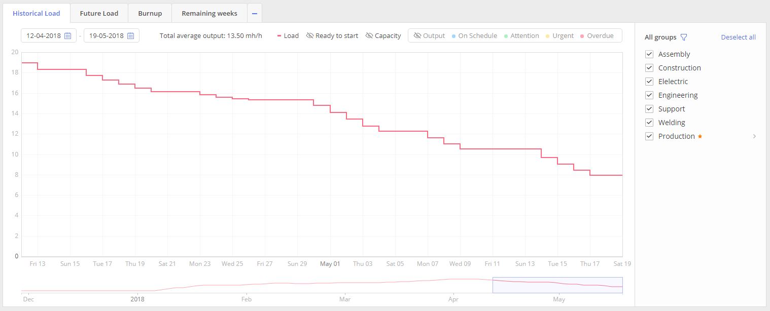
Screen #3.2 – Historical Load graph – Load
READY TO START, visualized as dot red line, shows historical amount of workload over none blocked tasks.In other words it’s a tasks list in “Ready to start” stage. In comparison to Load it doesn’t include blocked tasks in “Not ready to Start” and “Upcoming” stage.
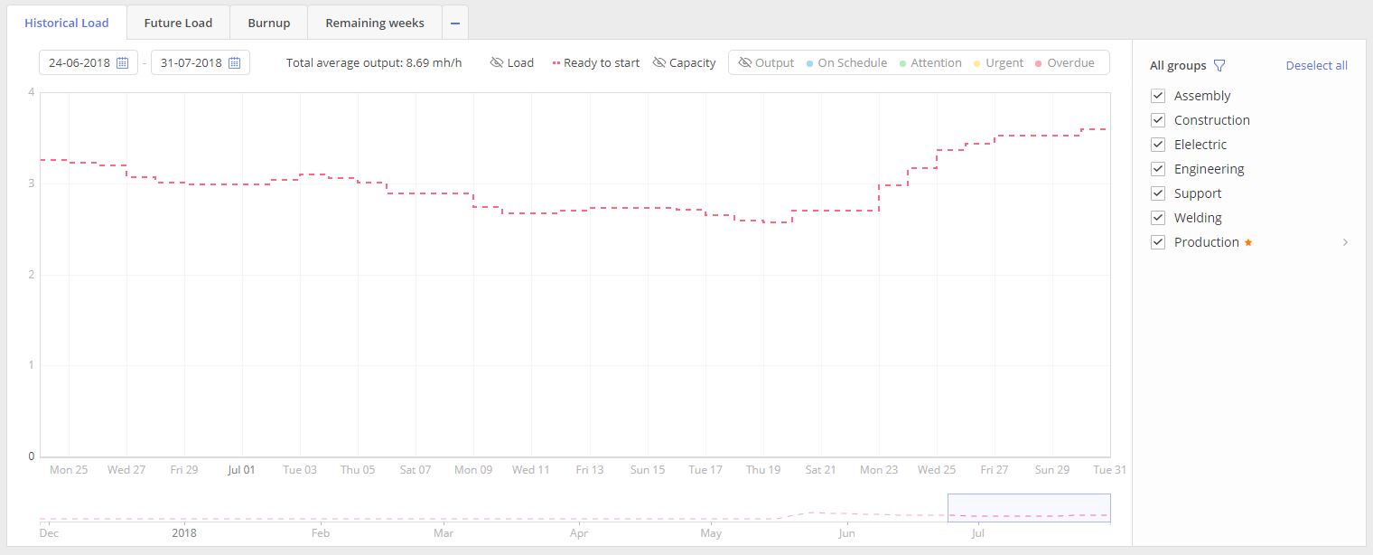
Screen #3.3– Historical Load graph- Ready To Start
CAPACITY, depicted as a blue line, indicates expected output from the team based on historical availability and working hours for each team member.
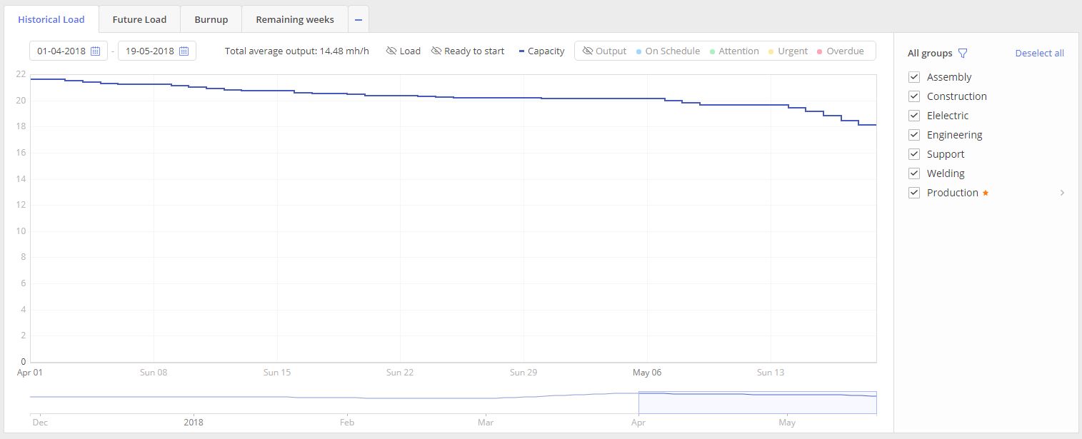
Screen #3.4 – Historical Load graph- Capacity
OUTPUT, depicted as a light-blue line, shows historically produced output in FTE by the team.
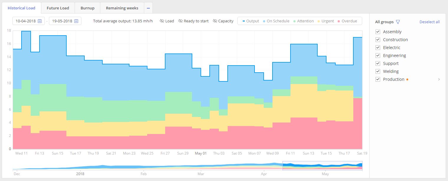
Screen #3.5 – Historical Load graph – Output
At the same moment Output is divided into next subgroups:
- On Schedule (Blue)
- Attention (Green)
- Urgent (Yellow)
- Overdue (Urgent)
Color of the subgroup has the straight connection to the priority of the closed task which indicates an urgency of the task at the time of its accomplishment
Graph elements
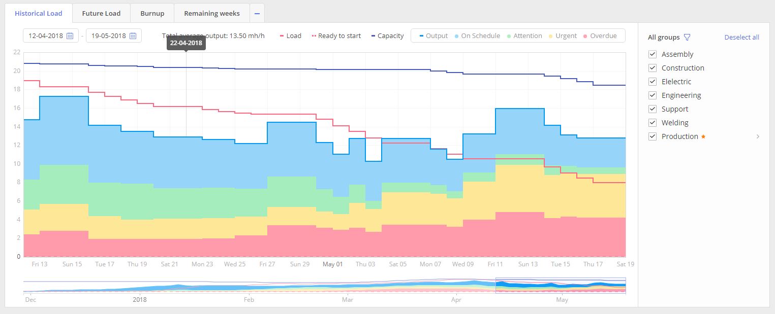
- To set a period for the graphs data representation you can
- set start and end date right in the appropriate date pickers, located in the left top corner.
- the timeline for the graphs adjusts automatically based on the selected range and can be displayed in days, weeks, or quarters.
- in opposition to that, you can drag left or right corners in the bottom graph representation
- System also allows to perform zooming-in zooming-out by scroll-mouse button usage.
- To move over the graph, with some defined in the date pickers range, you can either
- drag the bottom graph representation
- or drag graph itself
- To refine Graph’s data representation, for any particular Resource group(s), select the appropriate one from the list “Resource groups”, located to the right from the Graph itself.
- For Multigroups you can click over the “Next” icon, located to the right from the group name, to visualize graph only for groups which are part of the Multigroup.
Monitor historical data
Recommendations
Main strategy here is to perform a joint periodic overview with the team to analyze historical output and define causes why it was low. The ideal situation an output equal to capacity.
Few items to pay attention to:
- If the system does not display the output and capacity lines at the same level, there are reasons why your team does less than it could and cannot produce the expected output.
- If the load line is higher than output and capacity, it means that your resource groups are overloaded, and it is one of possible reasons why your team’s output is not equal to capacity.
- Balancing the load and capacity will help you achieve better output.
Dependency between Load and Output
The team should not be overload, otherwise, the output will drop.
Keep Load stable on the Capacity level and monitor output.
Monitoring the Load and Output
The periodic overview is obligatory for the team and successful project flow. Each peak and fluctuation must be analyzed to improve the process and learn the lesson on performed mistakes.
Monitoring team daily team performance
Our recommendation is to involve the team and lead them in finding explanations on depicted Historical Load. It will keep team concentrated and also help to define impediments on earlier stages.
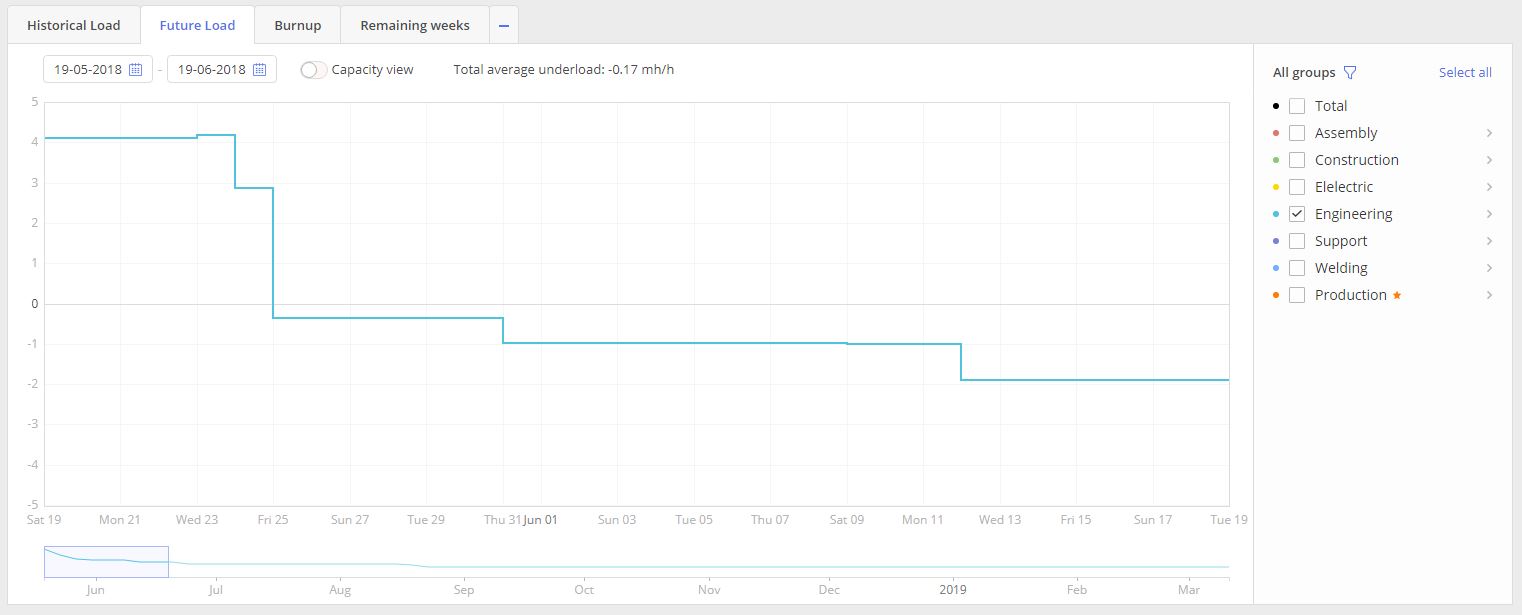
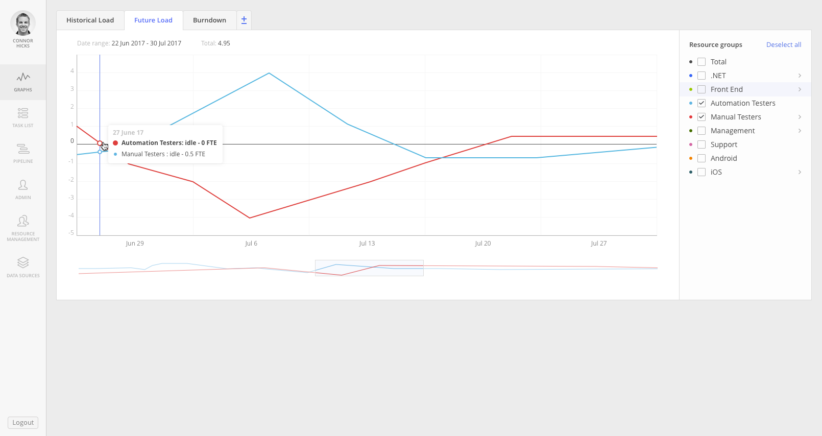
Future load
Overview
The purpose of this graph is to display a picture of Load for any groups or resources in accordance to the active projects in Pipeline active area. It helps management to take control on resource planning and predict the impact from additional projects.
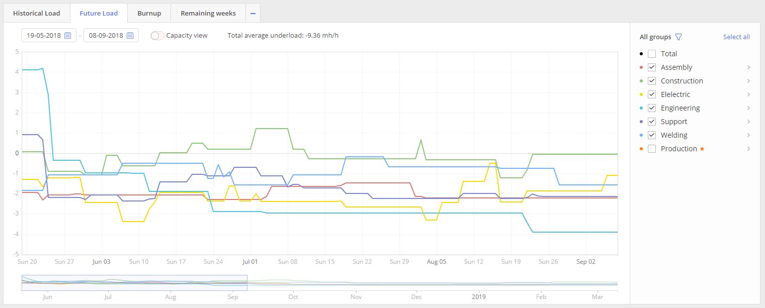
Screen #4 – Future Load graph
- Select “Future Load” tab in the left top corner of the Graphs page.
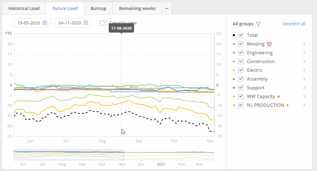
Visualized graph with two axes “Date” and “FTE” (Full-time equivalent) will contain information for all selected Resource groups or Users from the “Resource Groups” list area to the right from the graph itself.
Screen #5 – Future Load graph for one group
When we have line of the Group’s load above x axis system indicates overload for the particular resource group.
In case if graph line is located bellow x axis we can say for sure that particular resource group is not loaded enough.
Improved visualisation mechanism of end user notification
Improved visualisation mechanism of End User notification about possibility to highlight a line on the depicted graph.
Whenever you are hovering over the Graph line, highlighting of the corresponding Group/User name is done.
Similarly, hovering over the Group/User name will indicate your current selection with the “Target” icon.
Additionally, a hint is shown that selected line can be highlighted.
Besides the graphs menu, you can also find this graph on pages:
- Resource Management;
- Task List Group view – this graph has additional functionality Capacity view for the Team Schedule;
- Pipeline – this graph at Pipeline page has added Inactive and Load Analysis that helps to identify items which are creating load for the specified period. That is a powerful tool for the further Load and Capacity analysis in prospective of Project per teams.;
Graph elements
- To set a period for the graphs data representation you can
- set start and end date right in the appropriate date pickers, located in the left top corner.
- in opposition to that, you can drag left or right corners in the bottom graph representation
- System also allows to perform zooming-in zooming-out by scroll-mouse button usage.
- To move over the graph, with some defined in the date pickers range, you can either
- drag the bottom graph representation
- or drag graph itself
- To refine Graph’s data representation, for any particular Resource group(s), select the appropriate one from the list “Resource groups”, located to the right from the Graph itself.
- For Multigroups you can click over the “Next” icon, located to the right from the group name, to visualize graph only for groups which are part of the Multigroup. The same action can be done for a group to review load per each resource assigned to the group.
- To highlight any particular line, for all defined period, hover your mouse cursor over the line
- or hover over mouse cursor on the Resource name in “Resource groups” list area
- or click left mouse button on the color icon to the left from the Resource name in the “Resource groups” list area
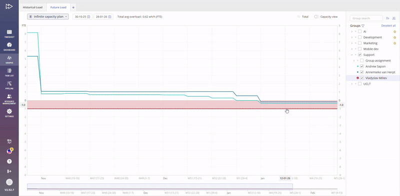
Capacity View
Screen #6 – Future Load graph – Capacity view
Additional function for the Future Load graph is “Capacity View” mode. In such mode system represents your team’s capacity changes in accordance to holidays\vacation or illness periods of your resources. “Capacity View” is designed to help project managers see what is the actual capacity of your employees in comparison to their load and output.
- switch on toggle “Capacity View” to have this mode activated
All functionality described for the future Load graph also can be used for the “Capacity View” mode.
Manage Future Load
Predicting future bottleneck
Screen #7- Bottleneck
Future Load graph helps to define bottlenecks beforehand and apply actions to solve such. Each resource lack and overload of such in result will lead to delays and losses on project flow.
To resolve future bottleneck you can hire more resources or adjust the timetable.
Do more with less
You can predict which group will be idle and overloaded in the future. In case that they share similar skills, you can retrain idle group so that they be able to help overloaded group and avoid delay. You can try.
Monitor Future Load data
Recommendations
Main strategy here is to Avoid situations when you have team all time overloaded. Cause, As we’ll see it on the Historical Load Graph, in case of overload, team will experience an output falling.
Few items to pay attention to:
- Future Load review must be used as an additional tool of control to identify moment in time, starting from which, team wont be able to accomplish all planned work for the set period.
- In joint usage with “What-If analysis” tool it can grant good basis for analysis and understanding of action items which must be taken to keep projects flow in most efficient way.
- Keep in mind that under-load for the team also can have negative effects as for the project and team itself.Load balancing is the key to success.
You may also be interested in the article Workload Analysis.
Burn-up graph
Overview
The purpose of this graph is to display a picture of the current and historical status on project(s) accomplishment in a way of costs control and that the project didn’t cross estimated boundaries.
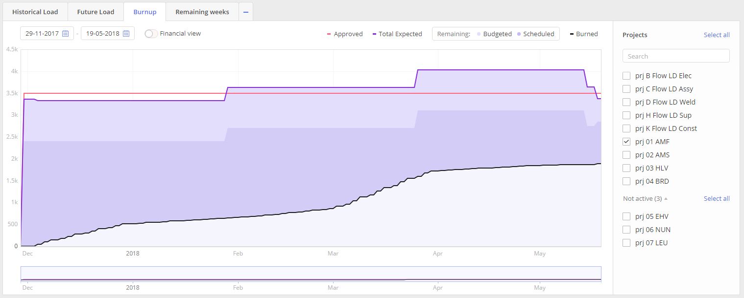
Screen #9 – Burn-up graph
- Select “Burnup” tab in the left top corner of the Graphs page. If there is no such tab you need to click on “+” sign and select an appropriate one graph type accordingly to display.
Visualized graph is presented on two axes “Date” and “Cost Estimation”(measured in work hours) area and contains information for all selected Projects from the “Porjects” list area to the right from the graph itself.
Graph itself is presented as a three composing graphs line and areas:
- Approved
- Total Expected (Remaining)
- Budgeted
- Scheduled
- Burned
APPROVED, presented as a red line, indicates planned project’s cost measured in work hours.
TOTAL EXPECTED, a purple one, is an indication of estimated project cost and it consist of two areas:
- Budgeted
and
- Scheduled.
First one is a set of our reserves and second one is an indication of the part which is already assigned for some work accomplishment.
Last area is BURNED. Meaning of it, is the costs which already are spent on project accomplishment.
Graph elements
- To set a period for the graphs data representation you can
- set start and end date right in the appropriate date pickers, located in the left top corner.
- in opposition to that, you can drag left or right corners in the bottom graph representation
- System also allows to perform zooming-in zooming-out by scroll-mouse button usage.
- To move over the graph, with some defined in the date pickers range, you can either
- drag the bottom graph representation
- or drag graph itself
- To refine Graph’s data representation, for any particular Project(s), select the appropriate one from the list “Projects”, located to the right from the Graph itself. Note that Projects list is divided into two blocks in a similar way to Pipeline: Active and Not Active.
Financial view
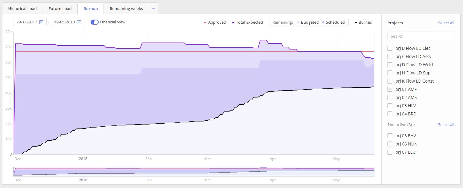
Screen #10 – Burn-up graph – Financial view
In advance settings, you have an opportunity to view the finance status. You should have permission to monitor this information.
Recommendations
Main strategy here is to have a periodic overview from Project Manager side to control budget and flow of the project. You need to control situation and do not allow running out of estimated Budgeted area and furthermore fit in to Approved expenses.
Remaining weeks
Overview
The purpose of this graph is to display a historical dynamic how the total value of planned work in Weeks was decreasing in time for each Resource group or Resource.
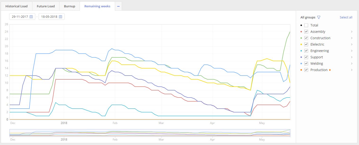
Screen #11 – Remaining weeks graph – Financial view
- Select “Remaining weeks” tab in the left top corner of the Graphs page.
Visualized graph is presented on two axes “Date” and “Remaining weeks” area and contains information for all selected Group(s) from the “All groups” list area to the right from the graph itself.
Graph elements
- To set a period for the graphs data representation you can
- set start and end date right in the appropriate date pickers, located in the left top corner.
- in opposition to that, you can drag left or right corners in the bottom graph representation
- System also allows to perform zooming-in zooming-out by scroll-mouse button usage.
- To move over the graph, with some defined in the date pickers range, you can either
- drag the bottom graph representation
- or drag graph itself
- To refine Graph’s data representation, for any particular Resource group(s), select the appropriate one from the list “Resource groups”, located to the right from the Graph itself.
- For Multigroups you can click over the “Next” icon, located to the right from the group name, to visualize graph only for groups which are part of the Multigroup.
Special management features
Both the Load Analysis and Bottleneck Analysis tools are indispensable for organizations aiming to refine their resource management tactics. These features provide a data-driven avenue for optimizing resource and project administration, resulting in marked gains in efficiency and productivity.