Overview
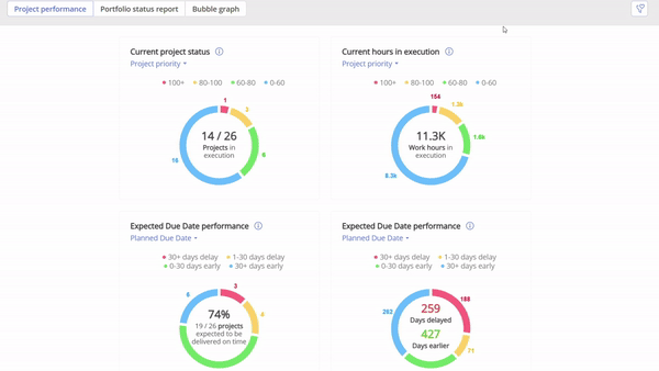
Located under the dashboard icon in the left pane, the Project Performance Dashboard offers an at-a-glance view of all active projects in the pipeline. The dashboard includes four primary metrics:
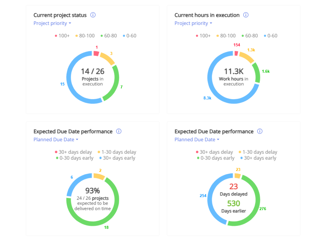
- Current Project Status
- Current Hours in Execution
- Expected Due Date Performance (EDDP) Percentage
- Expected Due Date Performance (EDDP) in Days (too late/early)
We’ll delve into each metric individually.
#Screen 1 Dashboard Overview
Permissions to activate dashboard
- Navigate to ‘Settings’ via the left pane.
- Go to the ‘Roles & Permissions’ tab.
- Choose the role(s) that should have access to the Project Performance Dashboard (e.g., Administrator, Project Manager, Portfolio Manager).
- Under ‘Global Permissions’, ensure that ‘View Dashboard’ is activated.
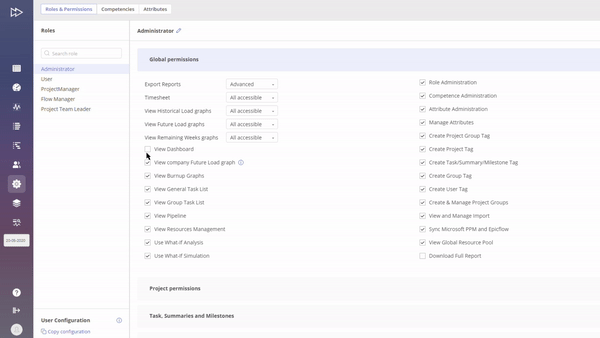
#Screen 2 Permissions to activate dashboard
Other permissions involved:
- In “project permissions” the permissions:
- “Manage Prediction” in order to recalculate the EDDP.
- “Business value” permission in the project card must be “view” or “manage” in order to calculate performance based on business value.
- “Baseline” permission must be be “view” or “manage” in order to calculate performance based on baseline.
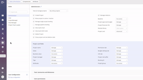
#Screen 3 Project Permissions
- In “global permissions” to “view pipeline” in order to view the projects.
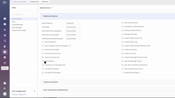
#Screen 4 Global Permissions
Metrics Explained
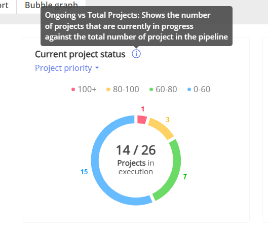
Current project status
This metric visually represents the number of projects in execution versus the total projects in the pipeline. The aim is to control Work in Progress (WIP), which signifies the concurrent projects in execution. Limiting WIP optimizes work flow and throughput. By limiting WIP, teams can focus on completing tasks rather than constantly switching between them, which is known as multi-tasking and tends to be inefficient due to the cognitive load of task-switching.
The surrounding ring indicates project priorities, represented by colors: red, yellow, green, and blue.
#Screen 5 Current Project Status
Modes (select at top left corner of this metrics):
- Project Priority: Shows number of projects by priority.
- Milestone Feasibility: Shows projects by milestone status.
In summary, current project status indicating the WIP is not just a metric but a vital management tool that, when used effectively, can drive various aspects of operational excellence.
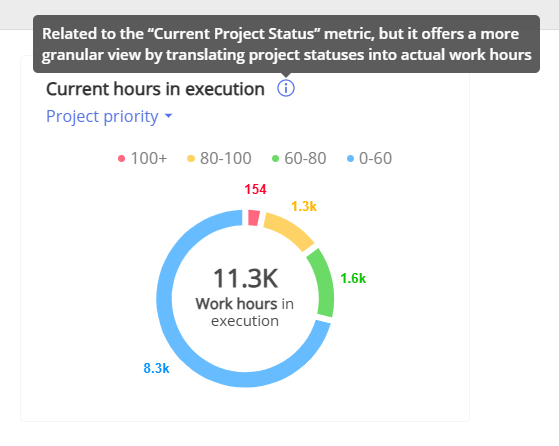
Current hours in execution
The “Current Hours in Execution” metric is closely related to the “Current Project Status” metric, but it offers a more granular view by translating project statuses into actual work hours. The inner circle of this metric displays the total work hours currently in execution, while the surrounding ring color-codes these hours according to priority categories: red, yellow, green, and blue.
This nuanced approach enables more precise management decisions. For instance, let’s say you have two projects labeled as “red” in the “Current Project Status.” The “Current Hours in Execution” metric can indicate just how critical each project is by showing the work hours involved. It might reveal that one project requires only 10 work hours to move out of the red zone, while another might require hundreds. This depth of insight is critical for effective project management.
Note that a similar methodology is employed in the bubble graph to provide a multifaceted view of project status.
#Screen 6 Current Hours in execution
Modes (select at top left corner of this metrics):
- Project Priority: Displays work hours by priority.
- Milestone Feasibility: Displays work hours by milestone status.
In summary, the “Current Hours in Execution” metric provides a nuanced quantification of the project statuses, allowing management to make informed, proportionate decisions based on the real-time situation..
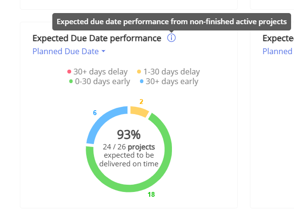
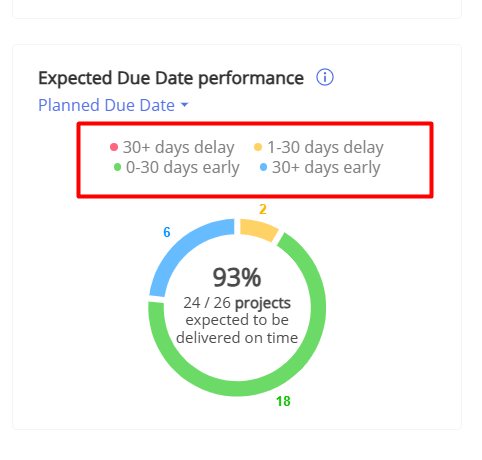
Expected due date performance percentage
The Expected Due Date Performance (EDDP) metric is a valuable tool for assessing the effectiveness in project delivery. The metric measures how well an organization is able to meet its committed due dates, thereby serving as an indicator of customer service, operational effectiveness, and overall performance.
#Screen 7 Expected Due Date Performance
The metric’s inner circle displays the EDDP percentage, accounting for all active projects in the pipeline that the user has access to. The expected due date is derived from the project prediction process.
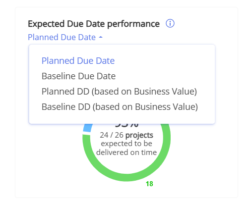
EDDP is determined by contrasting the expected due date with either the initially planned due date or the baseline due date. These options can be chosen from the top left corner of this metric display. Additionally, a variant of the metric allows you to focus only on projects with a business value greater than or equal to a specified figure. This feature enables the exclusion of certain projects from the EDDP calculation. The related business value can be configured in the project card.
#Screen 8 Expected Due Date Performance Options
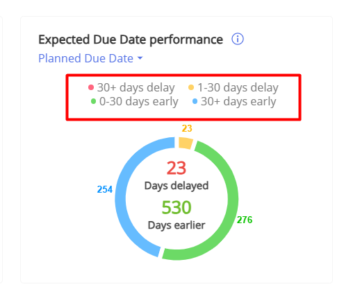
The colored ring surrounding the EDDP metric visually categorizes projects into four distinct performance groups:
- Red: Projects significantly delayed, running more than 30 days late.
- Yellow: Projects experiencing minor delays, falling 1 to 30 days behind schedule.
- Green: Projects delivered on time or ahead of schedule by up to 30 days.
- Blue: Projects completed substantially early, finishing more than 30 days ahead of the planned due date.
Note: The specified day ranges can be customized to fit your requirements, courtesy of our system administrator.
#Screen 9 Expected Due Date Colors Visualisation
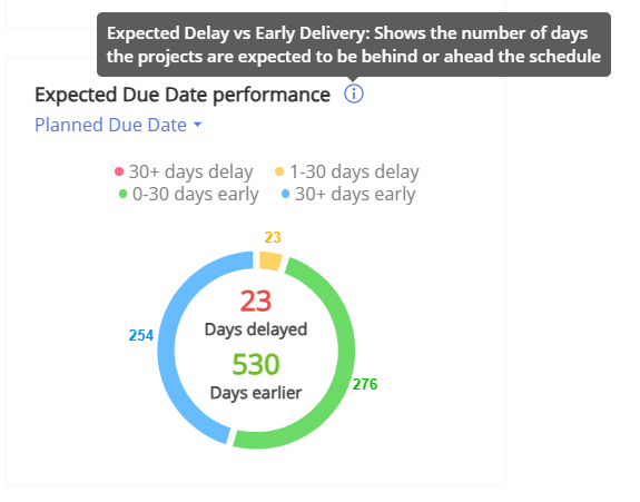
Expected due date performance in days too late/early
The “expected due date performance in days” metric provides a measure of EDDP in terms of actual days delayed or days completed ahead of schedule, rather than in percentages. Apart from this distinction, all other features of this metric align with those of the previous one, which presents EDDP as a percentage.
#Screen 10 Expected due date performance in days too late/early
To determine the number of days, we compare the expected due date—derived from project prediction—with either the planned or baseline due date for each project, calculating the difference in calendar days.
Like the EDDP percentage metric, the colored ring around this metric also divides projects into the same four categories. The only difference is that this metric displays the number of days for each category, rather than the number of projects.
Screen 8 Expected due date performance: Colored ring Categories
In summary, the EDDP in days and EDDP in percentage metrics, as featured in Epicflow, serve as valuable tools for assessing an organization’s ability to meet due dates effectively. Epicflow quantifies EDDP in a way that offers additional insights into due date performance, enriching your understanding of organizational efficiency.
Expected due date performance in general
In summary, Epicflow’s EDDP metrics, both in days and percentage formats, are indispensable for evaluating how well your organization adheres to project deadlines. These metrics go a step further by quantifying EDDP, thereby granting additional insights into your organizational due date performance.
However, it’s important to interpret EDDP cautiously. A high EDDP might offer a deceptive sense of accomplishment, potentially concealing inefficiencies, buffers, or looming challenges within your organization.
On the other hand, a low EDDP could actually be a symptom of resource overload, which can be evident when examining the future load graph. This graph can show that resources may be over-allocated in an attempt to meet deadlines, leading to inefficiencies and potential burnout. Resource overloads cause resource waiting times, resulting in a low DDP.
Therefore, EDDP should not be the sole yardstick for measuring project or organizational success. It’s crucial to analyze this metric alongside other key performance indicators, such as future load and historical output, for a more comprehensive view of your organization’s efficiency.
Use case with project performance dashboard
The Project Performance Dashboard is especially valuable when used in conjunction with the What-If Analysis feature for comparing various scenarios. A suggested workflow could be:
- Establish the project baselines.
- Execute Prediction.
- Open the Project Performance Dashboard and capture the current metrics, for example, by taking a screenshot.
- Navigate to the What-If Analysis feature.
- Make adjustments to the portfolio, such as adding new projects, moving milestones, or allocating additional resources.
- Perform Prediction again.
- Revisit the Project Performance Dashboard and compare the new data with the previously saved metrics.
- Implement the approved changes in the production environment.
Filters
You have the option to use saved filters in the Dashboard Graph in the Project Performance, Portfolio Status Report or Bubble tab. Read this article to learn how to create them.
To apply saved filter follow these steps:
- Navigate to the Dashboard.
- Select the Project Performance tab, the Portfolio Status Report tab or the Bubble graph.
- In the top-right corner, click on the saved filters icon.
- Select the desired filter to apply.
Screen 9 Dashboard Filters